
Turn a transcript into a YouTube thumbnail prompt
Paste your video title and transcript. You get a click-worthy thumbnail idea plus a ready-to-paste image prompt to drop into any AI image tool. It writes the concept and the prompt for you, not the final image, so you never start from a blank canvas. Free.
2×
higher CTR with a face
3 words
the high-CTR sweet spot
60s
to a ready concept
From your video
to a thumbnail in 3 steps
No Photoshop, no blank canvas, nothing to buy. The AI does the concept work, you just approve it and generate.
Paste your title and transcript
Drop in your video title, and its transcript if you have it. The AI reads them to find the one hook worth putting on a thumbnail.
Get a thumbnail idea + prompt
You get a bold two-tier headline plus a ready-to-paste image prompt, built on high-CTR rules: one expressive face, extreme contrast, almost no text. This is the idea and the prompt, not the final image.
Generate it in any AI image tool
Copy the prompt into the AI image tool of your choice, or send it to Studio AI in one click, then tweak and render the finished thumbnail.
A first draft,
not the final thumbnail
Be honest: AI still makes thumbnails that look a little AI. What this really hands you is the composition, the part that is hard to get right. Use it as a starting point, then make it yours.
Beats a blank canvas
When you have no idea what you want, a finished concept to react to is gold. The face placement, the hierarchy, the text size, the contrast, all decided for you. That is the hard part, done.
Fast enough to just ship
In a hurry? The draft on its own will already out-click a plain screenshot or a homemade title card. Use it as-is, upload, and move on to the next video.
Best used as a base to edit
The real move: take it into an AI image editor, swap the background, drop in your own face, adjust the colors and text. Keep the composition, change everything else, and it stops looking generated.
The one thing to keep no matter what you edit: the hierarchy the concept gives you. The big face, the two words, the single object, the hard contrast. That is the part that earns the click.
What makes a
thumbnail get clicked
These are the patterns behind the thumbnails you actually click. You do not have to know them. They are already inside every concept this tool writes.
One expressive face
Thumbnails with a face showing one extreme emotion get far higher click-through rates than those without. Every concept centers a single face doing one thing, dialed to the max.
Almost no text
Cutting text length lifts CTR, and the top creators use one to three words. You get a big headline and a small support line, never a paragraph.
Extreme contrast
One dominant color and one complementary accent, bright and saturated, so the thumbnail pops at mobile size where most views happen.
18 YouTube thumbnail
ideas you can steal
Bold and realistic, all built on the same high-CTR rules. Hover any one to read its exact prompt, or send it straight to Studio AI.

A young man is the single focal point, his face filling about half the frame on the right third, mouth open in extreme shock, eyes wide, one hand on his cheek, eyes to camera, bright dramatic studio lighting. The left third is clean negative space over a hyper-saturated blue background with just one glowing golden vault door and a single stack of cash behind him (two supporting elements only, nothing cluttered). The curiosity gap: the money is in view but the winner is not decided. Heavy Impact headline in white with a thick black outline reads "LAST TO LEAVE" at maximum size, and just below it smaller bright-yellow text with a black outline reads "WINS $100,000". Keep all text and the face clear of the bottom-right corner and the bottom edge. Complementary blue-and-orange contrast, saturated not muted, sharp focus, high detail, 16:9, 1280x720, no watermark, no extra text.
Challenge
LAST TO LEAVE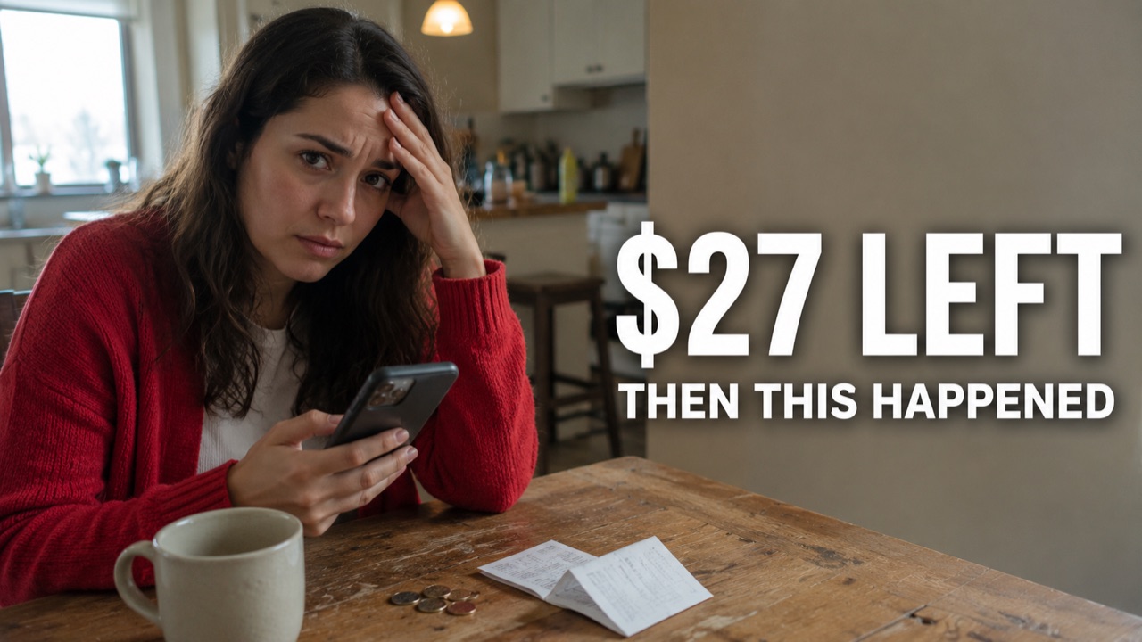
Candid photo shot on an iPhone by an ordinary person, not a commercial photoshoot. A woman in her late 20s wearing a red cardigan (the only strong color) sits at a kitchen table looking down at her phone banking app, one hand at her forehead, a worried, honest expression, glancing at the camera. She is the focal point on the left third, clean negative space on the right. Authentic skin with real variation: tiny redness around the nose and ears, subtle under-eye darkness, uneven skin tone, a faint blemish near the chin, fine lines, slight asymmetry between the eyes, realistic lip texture. Matte skin, no shine, no waxy or plastic look. Eyes have natural moisture and a little softness, not razor-sharp. The cardigan shows wrinkles, lint and slight fading. The kitchen feels used: an almost-empty coffee mug with a faint ring, a few coins and an open bill on the table, crumbs, a cluttered counter softly out of focus behind her, overcast daylight from a window mixed with a warm ceiling bulb. Subtle sensor noise, microscopic lens softness, slight chromatic aberration near high-contrast edges, gentle compression artifacts, imperfect depth-of-field transitions. Muted palette of warm wood and cream. Prioritize authenticity over beauty. Avoid pristine CGI cleanliness, over-symmetry, hyperperfect textures and showroom environments. Two-tier text on the right: H1 "$27 LEFT" in bold white sans-serif with a soft dark drop shadow, smaller H2 "THEN THIS HAPPENED" below. Keep text clear of the bottom-right corner and bottom edge. 16:9, 1280x720, no watermark, no extra text.
Finance
$27 LEFT
A chef is the single focal point, face filling about half the frame on the right third, lit up with pure joy and a huge delighted smile, eyes to camera, warm dramatic lighting. The left third is clean negative space over a saturated deep-red background with one thick, juicy steak searing over open flame, glistening and steaming (a single hero object). The curiosity gap: a restaurant-level steak with the method hidden. Heavy Impact headline in bright yellow with a thick black outline reads "PERFECT STEAK" at maximum size, and beneath it smaller white text with a black outline reads "EVERY TIME". Keep the text and face clear of the bottom-right corner and the bottom edge. Mouth-watering, saturated red-and-orange contrast, sharp focus, high detail, 16:9, 1280x720, no watermark, no extra text.
Cooking
PERFECT STEAK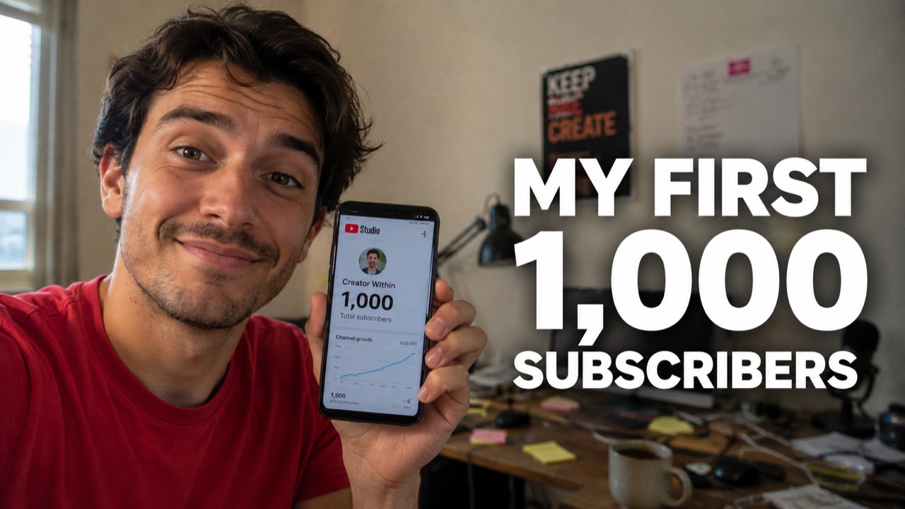
Candid selfie-style photo shot on an iPhone by an ordinary person, not a commercial photoshoot. A creator in their late 20s wearing a plain red t-shirt (the only strong color) holds up their phone toward the camera showing a YouTube milestone screen, face lit with genuine, understated joy and a real, slightly disbelieving smile, looking at the lens. They are the focal point on the left third, clean negative space on the right. Authentic skin with real variation: tiny redness around the nose and ears, subtle under-eye darkness, uneven skin tone, a faint blemish, fine lines, slight asymmetry between the eyes, realistic lip texture. Matte skin, no shine, no waxy or plastic look. Eyes have natural moisture and a little softness, not razor-sharp. The t-shirt shows wrinkles, lint, loose fibers and slight fading. The home studio feels lived-in: a messy desk with tangled cables, a coffee mug, sticky notes, a slightly crooked poster and soft daylight from a window mixed with a warm lamp, gently out of focus behind them. Subtle sensor noise, microscopic lens softness, slight chromatic aberration near high-contrast edges, gentle compression artifacts, imperfect depth-of-field transitions. Muted, natural room colors. Prioritize authenticity over beauty. Avoid pristine CGI cleanliness, over-symmetry, hyperperfect textures and showroom environments. Two-tier text on the right: H1 "MY FIRST 1,000" in bold white sans-serif with a soft dark drop shadow, smaller H2 "SUBSCRIBERS" below. Keep text clear of the bottom-right corner and bottom edge. 16:9, 1280x720, no watermark, no extra text.
Creator
MY FIRST 1,000
A maker in a tool apron is the single focal point, face filling about half the frame on the left third, proud open-mouthed grin, safety glasses pushed up, eyes to camera, bright dramatic lighting, holding one power drill with a little sawdust in the air. The right third is clean negative space over a saturated orange background showing one beautifully finished wooden shelf unit. The curiosity gap: a pro-looking build for almost no money. Heavy Impact headline in white with a thick black outline reads "I BUILT THIS" at maximum size, and beneath it smaller bright-yellow text with a black outline reads "FOR $50". Keep the text and face clear of the bottom-right corner and the bottom edge. Complementary orange-and-blue contrast, saturated, sharp focus, high detail, 16:9, 1280x720, no watermark, no extra text.
DIY
I BUILT THIS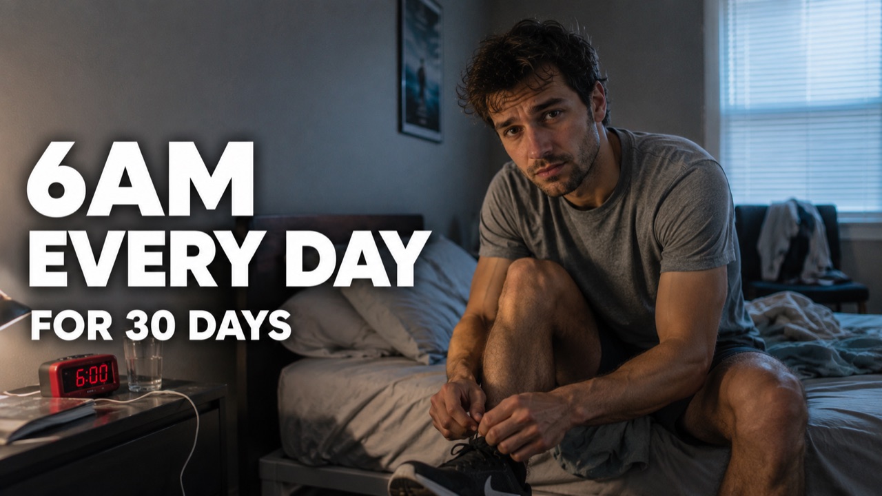
Candid photo shot on an iPhone by an ordinary person, not a commercial photoshoot. A man in his late 20s in a plain gray shirt sits on the edge of an unmade bed at dawn lacing a running shoe, hair messy, a tired but determined early-morning expression, glancing at the camera. A single red alarm clock on the nightstand is the only strong color. He is the focal point on the right third, clean negative space on the left. Authentic skin with real variation: tiny redness around the nose and ears, puffy under-eye darkness, a pillow-creased cheek, uneven skin tone, faint stubble of uneven density, fine lines, slight asymmetry between the eyes, realistic lip texture. Matte skin, no shine, no waxy or plastic look. Eyes have natural moisture and a little morning haze, not razor-sharp. The shirt shows wrinkles, lint and slight fading. The bedroom feels lived-in: rumpled sheets, a phone charging cable, a water glass, clothes over a chair, soft cool dawn light through the blinds mixed with a warm bedside lamp. Subtle sensor noise, microscopic lens softness, slight chromatic aberration near high-contrast edges, gentle compression artifacts, imperfect depth-of-field transitions. Muted dawn palette of gray and blue. Prioritize authenticity over beauty. Avoid pristine CGI cleanliness, over-symmetry, hyperperfect textures and showroom environments. Two-tier text on the left: H1 "6AM EVERY DAY" in bold white sans-serif with a soft dark drop shadow, smaller H2 "FOR 30 DAYS" below. Keep text clear of the bottom-right corner and bottom edge. 16:9, 1280x720, no watermark, no extra text.
Productivity
6AM EVERY DAY
A fit man is the single focal point, face filling about half the frame on the right third, jaw dropped in shock, sweat on his brow, eyes to camera, hard dramatic gym lighting, flexing one arm. The left third is clean negative space over a saturated deep-red background with one electric-cyan glowing dumbbell silhouette (a single cue). The curiosity gap: a dramatic transformation with the before hidden. Heavy Impact headline in white with a thick black outline reads "30 DAYS" at maximum size, and beneath it smaller bright-red text with a black outline reads "INSANE CHANGE". Keep the text and face clear of the bottom-right corner and the bottom edge. High complementary red-and-cyan contrast, saturated, sharp focus, high detail, 16:9, 1280x720, no watermark, no extra text.
Fitness
30 DAYS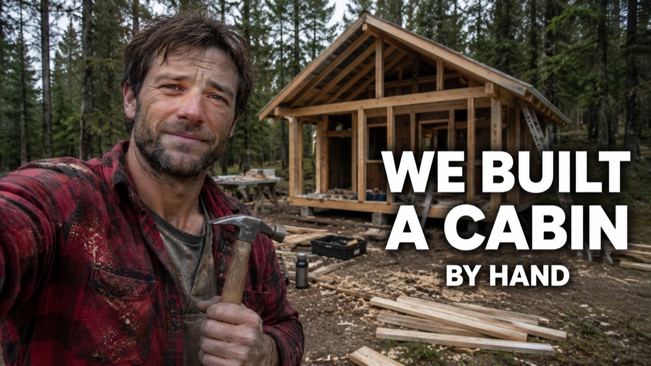
Candid photo shot on an iPhone by an ordinary person, not a commercial photoshoot. A man in his early 30s in a red flannel shirt (the only strong color) stands in a forest clearing in front of a half-finished timber cabin, a hammer in one hand, a genuine tired smile, looking at the camera. He is the focal point on the left third, clean negative space on the right showing the cabin. Authentic skin with real variation: sun-reddened nose and ears, subtle under-eye darkness, a smear of dirt, uneven beard density, weathered skin tone, fine lines, slight asymmetry between the eyes, realistic chapped lip texture. Matte skin, light real sweat but no glossy shine, no waxy or plastic look. Eyes have natural moisture and a little softness, not razor-sharp. The flannel shows wrinkles, sawdust, loose fibers, worn seams and fading. The site feels real: scattered offcuts of wood, a toolbox, wood shavings on the ground, a thermos, flat overcast forest daylight. Subtle sensor noise, microscopic lens softness, slight chromatic aberration near high-contrast edges, gentle compression artifacts, imperfect depth-of-field transitions. Muted natural greens and browns. Prioritize authenticity over beauty. Avoid pristine CGI cleanliness, over-symmetry, hyperperfect textures and showroom environments. Two-tier text on the right: H1 "WE BUILT A CABIN" in bold white sans-serif with a soft dark drop shadow, smaller H2 "BY HAND" below. Keep text clear of the bottom-right corner and bottom edge. 16:9, 1280x720, no watermark, no extra text.
DIY
WE BUILT A CABIN
A tech reviewer is the single focal point, face filling about half the frame on the left third, eyebrows raised in disbelief, eyes to camera, clean bright studio lighting, holding up one smartphone toward the camera. The right third is clean negative space over a saturated background split cyan on one side and orange on the other, suggesting cheap versus expensive. The curiosity gap: the cheap phone might beat the flagship, and the winner is hidden. Heavy Montserrat ExtraBold text in white with a thick black outline reads "$99 VS $999" at maximum size, and beneath it smaller bright-yellow text with a black outline reads "SHOCKING WINNER". Keep the text and face clear of the bottom-right corner and the bottom edge. Complementary cyan-and-orange contrast, saturated, sharp focus, high detail, 16:9, 1280x720, no watermark, no extra text.
Tech
$99 VS $999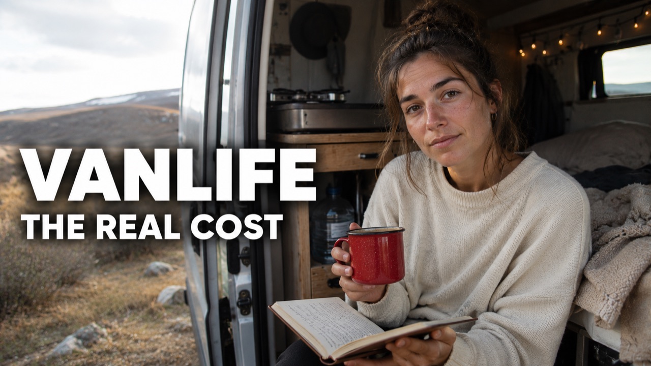
Candid photo shot on an iPhone by an ordinary person, not a commercial photoshoot. A young woman in a plain cream sweater sits in the open sliding doorway of a camper van holding a notebook and a red enamel mug (the only strong color), a candid, thoughtful expression, looking at the camera. She is the focal point on the right third, clean negative space on the left. Authentic skin with real variation: wind-reddened nose and ears, subtle under-eye darkness, uneven skin tone, a faint scatter of freckles, fine lines, slight asymmetry between the eyes, realistic lip texture. Matte skin, no shine, no waxy or plastic look. Eyes have natural moisture and a little softness, not razor-sharp. The sweater shows wrinkles, lint, loose fibers and slight fading. The van feels lived-in: a rumpled blanket, a small camp stove, string lights, a water jug, worn wood interior, warm afternoon daylight through the door mixed with cooler shade inside. Subtle sensor noise, microscopic lens softness, slight chromatic aberration near high-contrast edges, gentle compression artifacts, imperfect depth-of-field transitions. Muted, natural interior tones. Prioritize authenticity over beauty. Avoid pristine CGI cleanliness, over-symmetry, hyperperfect textures and showroom environments. Two-tier text on the left: H1 "VANLIFE" in bold white sans-serif with a soft dark drop shadow, smaller H2 "THE REAL COST" below. Keep text clear of the bottom-right corner and bottom edge. 16:9, 1280x720, no watermark, no extra text.
Travel
VANLIFE
A man is the single focal point, face filling about half the frame on the right third, wide-eyed in fear and regret, one hand gripping his head, eyes to camera, tense dramatic lighting. The left third is clean negative space over a saturated dark-red background with one steep, glowing red stock arrow crashing downward (a single story object). The curiosity gap: a painful loss with the reason hidden. Heavy Impact headline in white with a thick black outline reads "I LOST $10K" at maximum size, and beneath it smaller bright-yellow text with a black outline reads "HERE'S WHY". Keep the text and face clear of the bottom-right corner and the bottom edge. High-contrast dark-red-and-yellow palette, saturated, sharp focus, high detail, 16:9, 1280x720, no watermark, no extra text.
Finance
I LOST $10K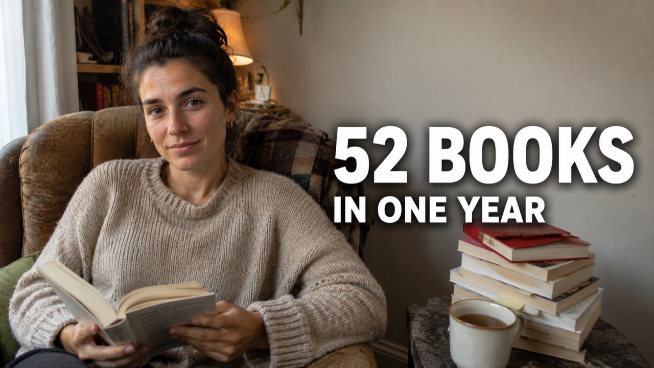
Candid photo shot on an iPhone by an ordinary person, not a commercial photoshoot. A woman in her late 20s in a plain oatmeal knit sweater sits in a worn armchair holding an open paperback, a calm, genuine half-smile, looking up at the camera. A single red hardcover on the stack beside her is the only strong color. She is the focal point on the left third, clean negative space on the right. Authentic skin with real variation: tiny redness around the nose, subtle under-eye darkness, uneven skin tone, a faint blemish, fine lines, slight asymmetry between the eyes, realistic lip texture. Matte skin, no shine, no waxy or plastic look. Eyes have natural moisture and a little softness, not razor-sharp. The knit shows pilling, loose fibers, wrinkles and slight fading. The room feels lived-in: a modest leaning stack of dog-eared books, a half-drunk mug of tea, a soft throw blanket, a scuffed side table, warm lamp light mixed with soft window daylight. Subtle sensor noise, microscopic lens softness, slight chromatic aberration near high-contrast edges, gentle compression artifacts, imperfect depth-of-field transitions. Muted, warm natural palette. Prioritize authenticity over beauty. Avoid pristine CGI cleanliness, over-symmetry, hyperperfect textures and showroom environments. Two-tier text on the right: H1 "52 BOOKS" in bold white sans-serif with a soft dark drop shadow, smaller H2 "IN ONE YEAR" below. Keep text clear of the bottom-right corner and bottom edge. 16:9, 1280x720, no watermark, no extra text.
Self-improvement
52 BOOKS
A young traveler is the single focal point, face filling about half the frame on the left third, eyes wide with excited curiosity and mouth open in amazement, eyes to camera, colorful neon light on the face. The right third is clean negative space over a saturated magenta-and-blue Tokyo night street with one glowing neon sign (a single hero object). The curiosity gap: surviving pricey Tokyo on almost nothing, with the how hidden. Heavy Impact headline in bright yellow with a thick black outline reads "$5 A DAY" at maximum size, and beneath it smaller white text with a black outline reads "IN TOKYO". Keep the text and face clear of the bottom-right corner and the bottom edge. Vivid complementary magenta-and-yellow neon contrast, saturated, sharp focus, high detail, 16:9, 1280x720, no watermark, no extra text.
Travel
$5 A DAY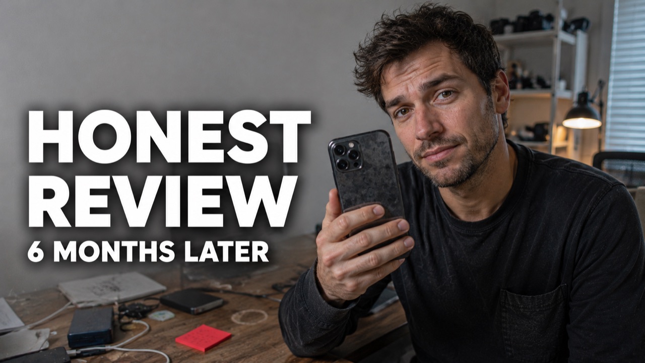
Candid photo shot on an iPhone by an ordinary person, not a commercial photoshoot. A man in his 30s in a plain dark shirt sits at a desk holding up a smartphone toward the camera with a neutral, honest, slightly skeptical expression, looking at the lens. A red sticky note on the desk is the only strong color. He is the focal point on the right third, clean negative space on the left. Authentic skin with real variation: tiny redness around the nose and ears, subtle under-eye darkness, uneven skin tone, faint stubble of uneven density, fine forehead lines, slight asymmetry between the eyes, realistic lip texture. Matte skin, no shine and no screen glow on the face, no waxy or plastic look. Eyes have natural moisture and a little softness, not razor-sharp. The shirt shows wrinkles, lint and slight fading. The desk feels used: fingerprints on the phone, tangled cables, a coffee-mug ring, a few gadgets and scattered papers, soft daylight from a window mixed with a warm desk lamp. Subtle sensor noise, microscopic lens softness, slight chromatic aberration near high-contrast edges, gentle compression artifacts, imperfect depth-of-field transitions. Muted, natural desk tones. Prioritize authenticity over beauty. Avoid pristine CGI cleanliness, over-symmetry, hyperperfect textures and showroom environments. Two-tier text on the left: H1 "HONEST REVIEW" in bold white sans-serif with a soft dark drop shadow, smaller H2 "6 MONTHS LATER" below. Keep text clear of the bottom-right corner and bottom edge. 16:9, 1280x720, no watermark, no extra text.
Tech
HONEST REVIEW
A gamer wearing a headset is the single focal point, face filling about half the frame on the right third, screaming with shocked excitement, eyes wide, eyes to camera, punchy purple RGB lighting, one clenched fist raised. The left third is clean negative space over a saturated deep-purple background with one glowing cyan victory burst (a single cue). The curiosity gap: a win pulled off at the last second, with the how hidden. Heavy Impact headline in white with a thick black outline reads "IMPOSSIBLE WIN" at maximum size, and beneath it smaller bright-cyan text with a black outline reads "LAST SECOND". Keep the text and face clear of the bottom-right corner and the bottom edge. Electric complementary purple-and-cyan contrast, saturated, sharp focus, high detail, 16:9, 1280x720, no watermark, no extra text.
Gaming
IMPOSSIBLE WIN
Candid photo shot on an iPhone by an ordinary person, not a commercial photoshoot. A woman in her 30s in a plain white tee and a red apron (the only strong color) stands at a kitchen counter holding a brown paper grocery bag with vegetables poking out, a genuine, friendly expression, looking at the camera. She is the focal point on the left third, clean negative space on the right with a few grocery items on the counter. Authentic skin with real variation: tiny redness around the nose and ears, subtle under-eye darkness, uneven skin tone, a faint blemish, fine lines, slight asymmetry between the eyes, realistic lip texture. Matte skin, no shine, no waxy or plastic look. Eyes have natural moisture and a little softness, not razor-sharp. The tee and apron show wrinkles, a small stain, lint and slight fading. The kitchen feels lived-in: a cluttered counter with a cutting board, a used dish towel, a fruit bowl, magnets on the fridge, soft daylight from a window mixed with a warm ceiling light. Subtle sensor noise, microscopic lens softness, slight chromatic aberration near high-contrast edges, gentle compression artifacts, imperfect depth-of-field transitions. Muted, natural kitchen tones. Prioritize authenticity over beauty. Avoid pristine CGI cleanliness, over-symmetry, hyperperfect textures and showroom environments. Two-tier text on the right: H1 "$200 A MONTH" in bold white sans-serif with a soft dark drop shadow, smaller H2 "OF GROCERIES" below. Keep text clear of the bottom-right corner and bottom edge. 16:9, 1280x720, no watermark, no extra text.
Frugal
$200 A MONTH
A student is the single focal point, face filling about half the frame on the left third, eyebrows raised in intrigued curiosity, eyes to camera, clean bright studio lighting, one finger pointing up at a single glowing brain icon. The right third is clean negative space over a saturated teal background with one softly glowing lightbulb (a single cue). The curiosity gap: less effort but sharper memory, with the method hidden. Heavy Montserrat ExtraBold text in white with a thick black outline reads "STUDY LESS" at maximum size, and beneath it smaller bright-yellow text with a black outline reads "REMEMBER MORE". Keep the text and face clear of the bottom-right corner and the bottom edge. High complementary teal-and-yellow contrast, saturated, sharp focus, high detail, 16:9, 1280x720, no watermark, no extra text.
Productivity
STUDY LESS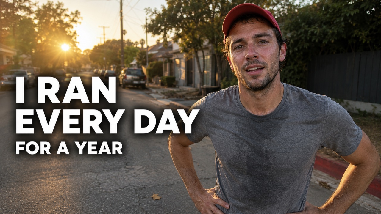
Candid photo shot on an iPhone by an ordinary person, not a commercial photoshoot. A man in his late 20s in a plain gray tee and a red running cap (the only strong color) pauses mid-run on a quiet residential street at golden hour, hands on hips, breathing hard with a real, tired, satisfied expression, looking at the camera. He is the focal point on the right third, clean negative space on the left. Authentic skin with real variation: flushed cheeks, tiny redness around the nose and ears, subtle under-eye darkness, uneven skin tone, faint stubble, fine lines, slight asymmetry between the eyes, realistic lip texture. Light real sweat kept subtle and matte, never glossy, no waxy or plastic look. Eyes have natural moisture and a little softness, not razor-sharp. The tee shows wrinkles, sweat patches, loose fibers and slight fading. The street feels real: parked cars, a curb, a stray leaf, power lines, soft warm low sun with long shadows and a little lens flare, background softly blurred. Subtle sensor noise, microscopic lens softness, slight chromatic aberration near high-contrast edges, gentle compression artifacts, imperfect depth-of-field transitions. Muted, natural street tones. Prioritize authenticity over beauty. Avoid pristine CGI cleanliness, over-symmetry, hyperperfect textures and showroom environments. Two-tier text on the left: H1 "I RAN EVERY DAY" in bold white sans-serif with a soft dark drop shadow, smaller H2 "FOR A YEAR" below. Keep text clear of the bottom-right corner and bottom edge. 16:9, 1280x720, no watermark, no extra text.
Fitness
I RAN EVERY DAYThe thumbnail decides
if anyone watches
You poured hours into the video. Whether anyone clicks comes down to one image, and that image is a skill nobody taught you. This tool hands you the skill.
You are a creator, not a designer
You can shoot and edit a whole video, but a blank thumbnail canvas is a different skill. Most creators open Photoshop or Canva and just stare at it.
The AI writes the whole concept for you, so you start from a finished idea, not an empty canvas.
Thumbnails eat your upload time
Designing a thumbnail from scratch can take as long as editing a section of the video, every single upload.
Paste, generate, done. A proven concept in under a minute instead of an hour of fiddling.
Low CTR, and you blame the wrong thing
When a thumbnail flops, people tweak colors and fonts. The real issue is almost always the concept: no clear hook, too much text, no emotion.
Every concept leads with one hook, one expressive face, and two words. That is what actually moves click-through rate.
You do not know the rules
High-CTR thumbnails follow patterns: one face, one emotion dialed to the max, extreme contrast, almost no text. Most creators never learn them.
The rules are baked into every prompt, so you get a pro-level concept without studying a single tutorial.
What makes a YouTube
thumbnail get clicked
Your thumbnail is the single biggest lever on whether a video gets watched. It has one job in two steps: stop the scroll, then earn the click. Here is what the data and the top creators agree on.
Where the click really comes from
Top strategist Paddy Galloway calls a great thumbnail “80 to 90% psychology and 10 to 20% design.” Most creators tweak fonts and colors when the idea is what actually moves the needle.
What a good click-through rate looks like
Most videos land between 2 and 10%. Because clicks scale with CTR, lifting it from 4% to 8% roughly doubles the views you pull from the same impressions.
The 6 ingredients of a thumbnail that gets clicked
One expressive face
A single human face showing one extreme emotion (shock, joy, fear, curiosity) with eyes to camera. Faces stop the scroll, and the emotion has to match the video or the click feels like a lie.
One clear focal point
One subject, one idea. If a stranger cannot get the story in two seconds, it is too busy. Keep it to two or three elements and leave real negative space around them.
Three to five words, max
A big, thick sans-serif (Impact, Anton, Bebas Neue) with a heavy outline. The text adds a new hook, it never just repeats your title.
Extreme contrast
Complementary colors (blue and orange, red and green, black and yellow), bright and saturated, so the frame pops against YouTube's white feed.
A curiosity gap
Show the result or the conflict, hide the how. Before and after, a shocking comparison, an impossible outcome. The gap between what they see and what they want to know is the click.
Readable at phone size
Most views happen on a small mobile rectangle. Shrink the thumbnail to about 120px wide. If you cannot read it or tell what it is, simplify until you can.
How to write a thumbnail prompt an AI gets right
A good prompt is specific, short, and built around one idea. Vague prompts give you flat faces and garbled text. These six rules are what turns a description into a click-worthy image.
The generator above already does all six for you from your title and transcript.
- 1
Use the triple threat. Subject plus object plus curiosity. Name one person, one object that carries the story, and the one thing you are hiding.
- 2
Name the emotion out loud. "Mouth open in shock", "wide-eyed disbelief". Vague prompts give you a flat, lifeless face.
- 3
Spell out the exact text in quotes. Put your words in quotes and keep them short. Image models garble long or unquoted text.
- 4
Be specific about the scene. Location, lighting, colors. Specific beats detailed-but-vague every time.
- 5
Stop at two or three elements. Overloaded prompts fight themselves and come out cluttered. Less is sharper.
- 6
End with the specs. 16:9, 1280x720, high contrast, no watermark, no extra text.
Specs that matter: export at 1280x720, 16:9, under 2MB. Keep key text out of the bottom-right corner (the timestamp) and the very bottom edge (the progress bar).
Frequently asked questions
Everything about turning your video into a thumbnail
Does this make the thumbnail image, or just a prompt for it?+
It writes the thumbnail concept: the exact headline text plus a detailed image prompt built on proven high-CTR rules. One click sends that prompt to Studio AI, where the actual thumbnail image gets generated. You get the concept here and the finished image there.
Do I really need to paste the whole transcript?+
No. The title alone works. The transcript just helps the AI find a sharper hook, so paste it if you have it. Even a one-line description of the video is enough.
Why only two lines of text on the thumbnail?+
High-CTR thumbnails use very little text. Studies show cutting text length lifts click-through rate, and top creators run one to three words. There is also a technical reason: AI image models render short bold text cleanly but turn long paragraphs into gibberish. Two tiers (a big headline and a small support line) is the sweet spot.
What makes a thumbnail actually get clicks?+
One expressive face doing a single extreme emotion, very few words, and extreme color contrast. Thumbnails with faces average far higher click-through rates than those without. This tool bakes all of that into every concept it writes.
What is a good click-through rate on YouTube?+
Most videos sit between 2 and 10%. Around 4 to 5% is typical, 8% is strong, and top creators push past 10% on long-form. Because clicks scale with CTR, moving from 4% to 8% roughly doubles the views you get from the same impressions, which is why the thumbnail is worth this much attention.
How many words should be on a thumbnail?+
Three to five words is the sweet spot, and never more than six. Use a big, thick sans-serif with a heavy outline, and make the text add a new hook instead of repeating your title. Long text also confuses AI image models, so short is both higher-CTR and cleaner to render.
Can I change the headline or the prompt before generating?+
Yes. The headline text and the full image prompt are both editable. Tweak a word, swap the emotion, or rewrite a line, then send it to Studio AI.
Does it work for any kind of channel?+
Yes. Gaming, podcasts, tutorials, vlogs, commentary, anything. The AI reads your title and transcript, so the concept matches your specific video instead of a generic template.
Is it free?+
Yes. Writing the thumbnail concept is free and unlimited. Generating the final image happens in Studio AI.
Get the click
your video earned
Paste your title, get a proven thumbnail concept, and generate it in one click. Free, no signup.
Start with your title
A high-CTR concept in under a minute.