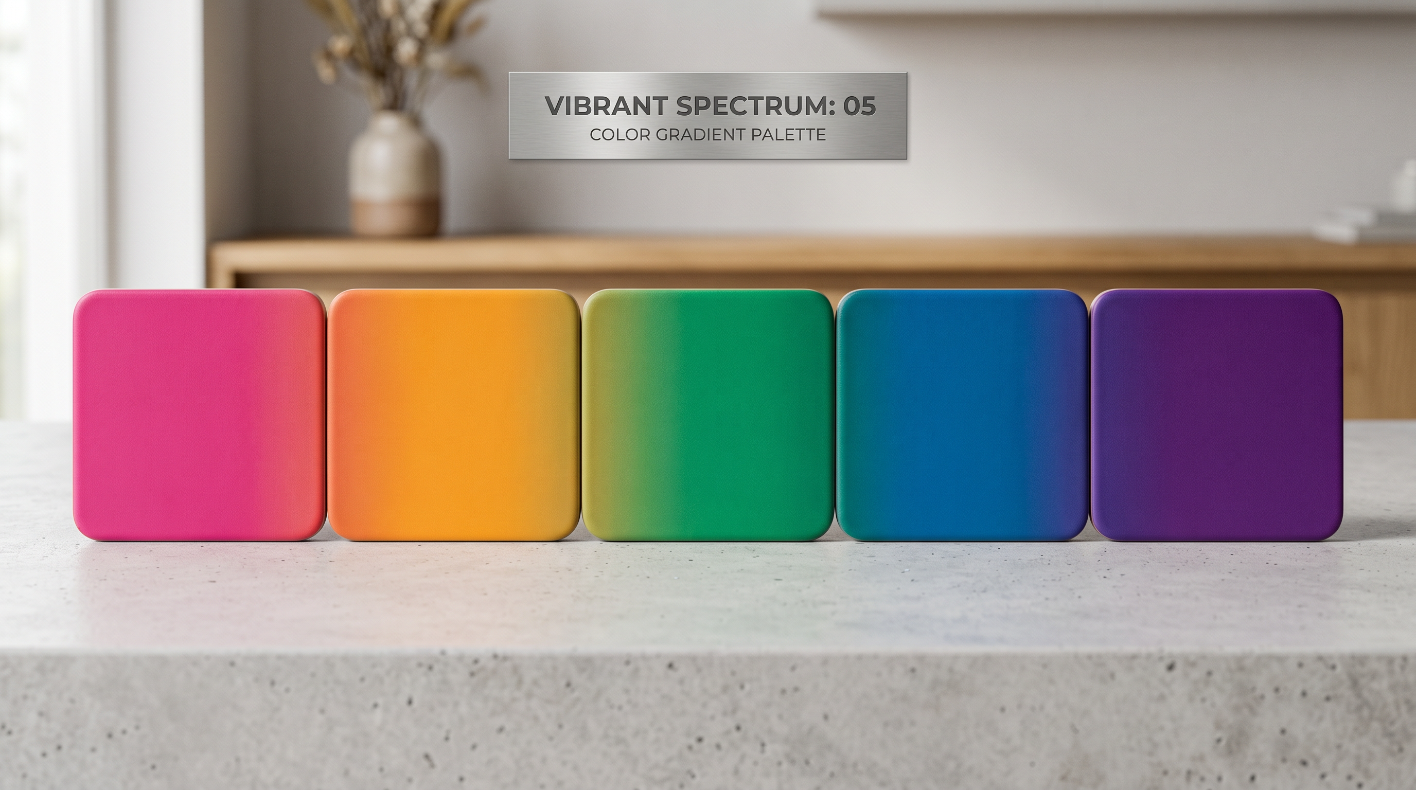
Free Color Palette Generator: 5 Harmony Modes Explained for Non-Designers
Picking colors by gut feel works fine until it doesn’t. You put together a palette that looks reasonable on your screen, export it, and suddenly everything feels off. Too loud, too flat, or no visual weight where there should be some.
Trained designers pick colors faster because of pattern recognition, not innate talent. They’ve seen enough complementary and analogous palettes to immediately know what “works” in a given context. This guide gives you that shortcut without the art school bill.
Why Picking Colors “By Feel” Is So Hard
Color harmony isn’t subjective. It’s grounded in how your eye processes contrast and saturation simultaneously. Two colors that look fine in isolation can fight each other when placed side by side because of how your eye moves between high-contrast areas.
The cognitive load is real: when you’re trying to assess whether a palette “works,” you’re running multiple mental checks at once (contrast, warmth/cool balance, whether anything is fighting for dominance) without a framework to organize the process. Color harmony rules give you that framework. They shortcut the trial and error into a structured starting point you can refine from.
The 5 Harmony Types, Explained in Plain English
1. Complementary — High Contrast, High Impact
Complementary colors sit directly opposite each other on the color wheel. Blue and orange. Red and green. Purple and yellow.
The result: maximum contrast. One color dominates, one accents. Your eye gets pulled sharply between them, which makes the overall composition feel energetic and clear.
When to use it: CTAs, logos, product packaging, anywhere you need something to stand out. Think Netflix’s red on black, or Amazon’s orange “Add to Cart” button. The contrast does the attention-getting work for you.
Watch out for: Using both colors at full saturation in equal proportions. That creates visual vibration where neither element wins. Use one color as the dominant and one as the accent at around 70/30 or 80/20 ratio.
2. Analogous — Calm, Cohesive, Easy to Look At
Analogous colors sit next to each other on the wheel: three or four colors in a row, like blue, blue-green, and green.
The result: everything feels unified. There’s no visual tension because there’s no extreme contrast. It reads as calm and cohesive.
When to use it: Backgrounds, hero sections, and brand palettes for industries commonly associated with trust or calm: healthcare, finance, wellness, and lifestyle brands. Instagram feeds that use an analogous palette have a consistent look without much effort.
Watch out for: Monotony. If all three colors are at the same saturation and value, the design looks flat. Mix tints and shades within your analogous range.
3. Triadic — Vibrant, Balanced, Hard to Pull Off
A triadic palette picks three colors equally spaced around the wheel, like red, blue, and yellow (the primary triad) or orange, green, and violet.
The result: high vibrancy with visual balance. Unlike complementary, no single color dominates by contrast. They compete equally. When done well, it feels playful and energetic without the tension of complementary.
When to use it: Infographics, data visualizations, children’s brands, and event marketing where you need visual energy without aggression. Also useful for social media graphics that need to stand out in a feed dominated by monochromatic or analogous palettes.
Watch out for: This one takes restraint. Use one color as dominant (about 60%), one secondary (30%), and one accent (10%). Full-strength triadic with equal proportions is the fastest route to visual chaos.
4. Split-Complementary — The Safer Bet
Split-complementary is a modified version of complementary that reduces the tension. Instead of picking the direct opposite, you pick the two colors on either side of the opposite.
So if your base is blue, instead of using orange (direct opposite), you’d use red-orange and yellow-orange. You still get strong contrast, but the palette is easier to live with over time.
When to use it: Brand palettes where you want impact without aggression. It’s the go-to for most commercial design where full complementary would feel too harsh, and it’s a good default if you like the energy of complementary palettes but find them visually exhausting.
5. Monochromatic — Sophisticated, Professional, Easy to Get Right
Monochromatic palettes use one base hue in multiple shades, tints, and tones: deep navy to sky blue to pale blue-white, for example.
The result: polished and unified. Nothing clashes because everything shares the same hue family. The variation comes from lightness and saturation, not competing colors.
When to use it: Professional services, luxury brands, portfolios, and any context where the imagery or content should dominate and the color palette should stay out of the way. When in doubt, monochromatic is harder to get wrong than anything else on this list.
How to Use the Free Color Palette Generator
Our free color palette generator builds palettes from any base color using all five harmony modes. Here’s the workflow:
- Pick a base color. Enter a hex code if you already have a brand color, or use the color picker to find your starting point visually.
- Choose a harmony mode. Select one of the five modes (complementary, analogous, triadic, split-complementary, or monochromatic) and the generator calculates the rest.
- Copy your hex codes. Click any swatch to copy its hex value. All major design tools (Canva, Figma, Adobe Express) accept hex codes directly.
- Export CSS variables. If you’re building a website, the export button generates ready-to-use CSS custom properties (e.g.,
--color-primary: #2563EB;) so you can paste them straight into your stylesheet. - Adjust and iterate. Rotate the hue wheel slightly if the generated palette is close but not quite right. Small adjustments (5–10 degrees) preserve the harmony while shifting the overall feel.
What Palette for What Project?
Different contexts have different requirements. Here’s a quick guide:
Social media posts: Analogous or complementary. Analogous for a consistent feed look; complementary when you need a single post to stop someone mid-scroll.
Website or landing page: Monochromatic for the base (keeps the UI clean), plus one complementary accent for CTAs only. More than two colors on a web UI creates visual competition.
Logo: Complementary or split-complementary if you want boldness; monochromatic if you want timelessness. Logos appear in grayscale sometimes, so check that yours works in black and white too.
Print materials (brochures, flyers, packaging): Analogous or triadic. Print has higher contrast tolerance than screens, and triadic palettes that would be too vibrant on-screen often look excellent in print.
Color Psychology Quick Reference
These are documented associations: patterns observed across marketing research and consumer behavior studies. Cultural context matters and individual reactions vary, but the patterns are consistent enough to be useful starting points:
- Blue is commonly associated with trust, reliability, and calm. Used by banks, social networks, and healthcare.
- Red is commonly associated with urgency, excitement, and appetite. CTAs, food brands, clearance sales.
- Green is commonly associated with growth, health, and sustainability. Finance apps (growth), wellness, environmental brands.
- Yellow is commonly associated with optimism, energy, and caution. Use as an accent; yellow backgrounds are hard to read for body text.
- Purple is commonly associated with creativity, luxury, and mystery. Premium products, beauty, spiritual brands.
- Orange is commonly associated with warmth, friendliness, and action. E-commerce CTAs (Amazon’s buy button is orange for a reason).
- Black is commonly associated with sophistication and authority. Works best as a dominant with one colorful accent.
- White is commonly associated with cleanliness, minimalism, and neutrality. The most underrated “color” in UI design; white space is design.
Studio AI includes color palette tools, background removal, image generation, and 30+ visual creation tools — all in one free trial. No design experience needed.
Frequently Asked Questions
What is the best color palette for a brand?
There’s no universal best. It depends on your industry and what you want to communicate. A reliable starting structure: one dominant neutral (often white, black, or dark gray), one primary brand color, and one accent. That three-color structure works for almost any brand regardless of which specific colors you choose.
How many colors should be in a brand palette?
Three to five. A primary color, a secondary or complementary color, one or two neutrals (black, white, or gray), and optionally one accent. Going beyond five active colors creates confusion: nothing reads as “brand” when everything is branded.
What’s the difference between a color scheme and a color palette?
They’re often used interchangeably, but technically: a color scheme is the type of relationship between colors (complementary, analogous, etc.), while a color palette is the specific set of colors you’ve chosen. Your scheme is the method; your palette is the result.
Can I use this for logo colors?
Yes. A color palette generator is a good starting point for logo color exploration. Paste your results into whatever design tool you’re using. One note: logos often appear in single-color or grayscale contexts (embossed, stamped, on dark backgrounds), so test your palette in black and white as well.
What are hex codes and do I need to understand them?
A hex code is a six-character combination (like #2563EB) that precisely identifies a specific color in digital design. You don’t need to understand the math behind them. You just need to be able to copy and paste them into design tools. Any tool that accepts color input will accept a hex code.